OVERVIEW
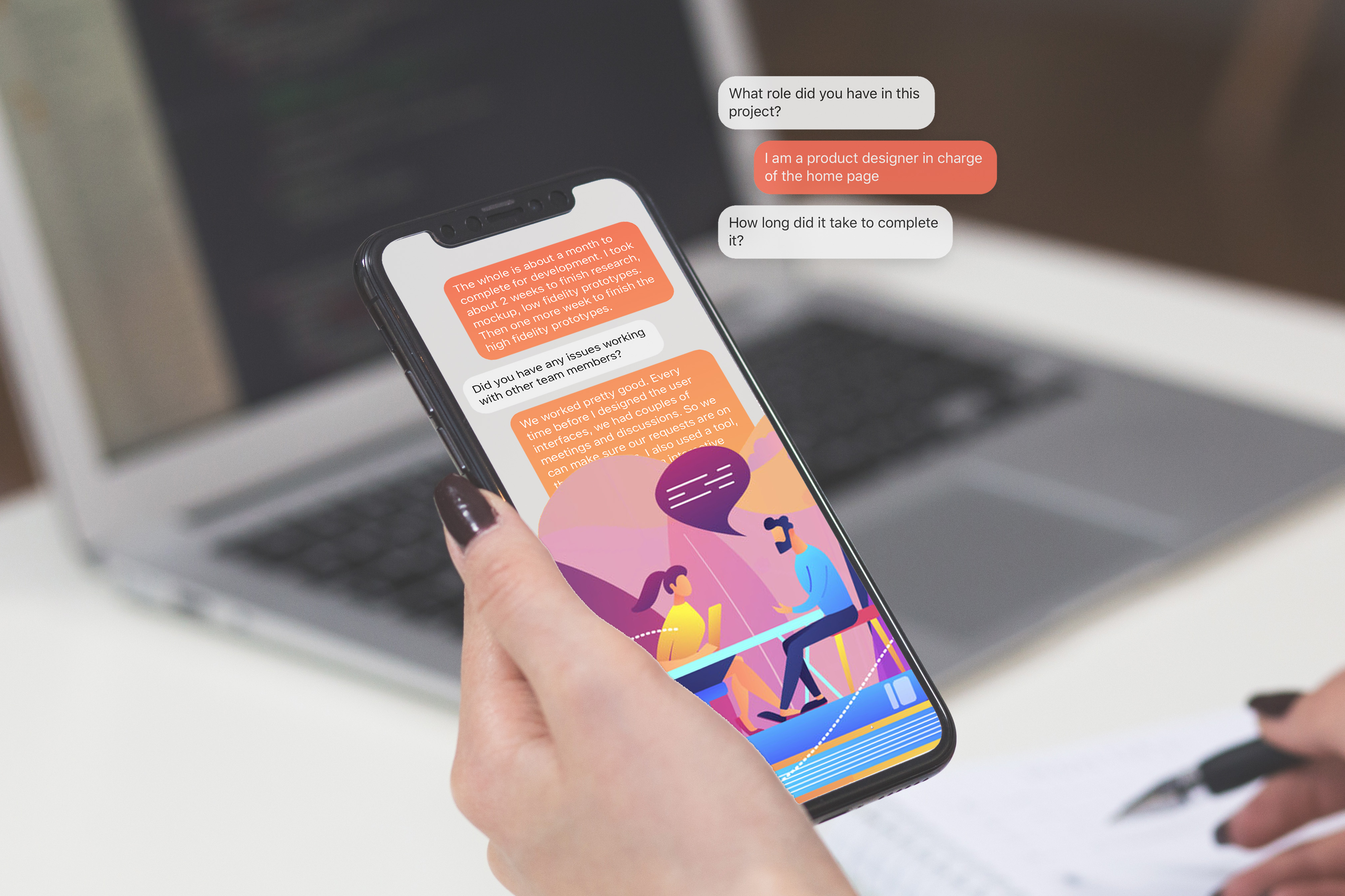
The goal of this AI Mock Interview app offers job interview training for job seekers, which guides users to build confidence around their talent. With this tool, users can practice how to structure better answers to a representative before real in-person interviews but rethink their interview skills from the advice from an AI tutor.
I came with the idea of how a digital tool can be very "warm-heart" and helps people who have self-motivation to build their skills. By collecting users' feedback, the app can customize the training courses based on their needs. The project is also inspired by an AI Friends app, Replika, which allows people to track their mental health through the interaction with a chatbot conversation.
OBJECTIVE
Emotional design, machine learning chatbots, minimum viable product(MVP)
ITEM
Graduate project
TOOLS
Sketch, Principle, Invision, UserTesting
PRESENTATION
Design proposal, Research carousel, Final slides
PERIOD
Sep 2020 - Dec 2020
DESIGN PROCESS
I decided to follow the design process, which was supported by emotion research and user feedback.

DESIGN PROPOSAL
AI Mock Interview App
- Project Tagline: Always here to help and support. Join to mock interviews with your AI tutors now!
- Target Users: Job seekers who want to improve their interview skills.
- Project Description: AI tutors offer customized and focused interview training to job seekers who need to build confidence around their talent. Practice consisting of a conversation between a job applicant and an AI representative. Provide hands-on and results-driven training to build your professional careers.
Design Question
I provided the Five Ws questions(Who, What, When, Where, Why) as below to gather information and problems that I intend to solve in this project. For example: with "Who" questions, I listed the potential users who might be involved in the app. The Five Ws questions also help me to develop my thoughts into the next step, research questions.
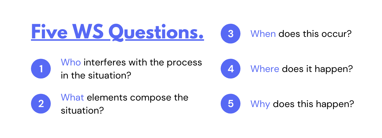
- Who interferes with the process in the situation?
- Users: job seekers and recruiters.
- Stakeholders: job seekers and companies.
- Clients: job seekers.
- Team: professionals in various industries.
- What element compose the situation?
- Actions: get training before a real interview.
- Behaviors: release nervous feelings by mock interview practices.
- Elements: tangible user interfaces, voice user interfaces, AR.
- Tools: smartphones or computers.
- When does this occur?
- Past: learn the strategies based on experts’ experiences and advice.
- Present: participate in the mock interviews.
- Future: fulfill careers and provide feedback after real interviews.
- Where does it happen?
- Geographically: a quiet room or any appropriate place.
- Culturally: customize to various cultures of companies or industries.
- Socially: hiring season, workplace.
- Why does this happen?
- Causes: guide job seekers with fewer experiences and weak strategies.
- Constraints: have no standard to follow for the right answers.
- Needs: built confidence through practicing and planning.
- Motivations: upgrade job seekers’ own values to raise competitiveness.
Research Questions
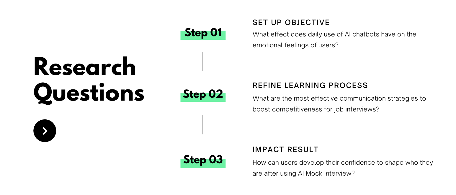
I intended to find out the following questions. How might we create a safe place to develop interview skills? Or how might we help people new to the job market feel less stressed about interviews? How might we coach job seekers to present their best selves? The idea of this product is so vague initially. I tried to ask questions in three key steps, which help me to figure out the scope of this product:
- Set up object: What effect does daily use of AI chatbots have on the emotional feelings of users?
- Refine learning process: What are the most effective communication strategies to boost competitiveness for job interviews?
- Impact result: How can users develop their confidence to shape who they are after using AI Mock Interview?
Finally, I narrowed down Research Question as below:
How does a person's emotion change before, during, and after a job interview?
What's users' opinions and feels when they talk to a chatbot or a computer?
EMOTION RESEARCH
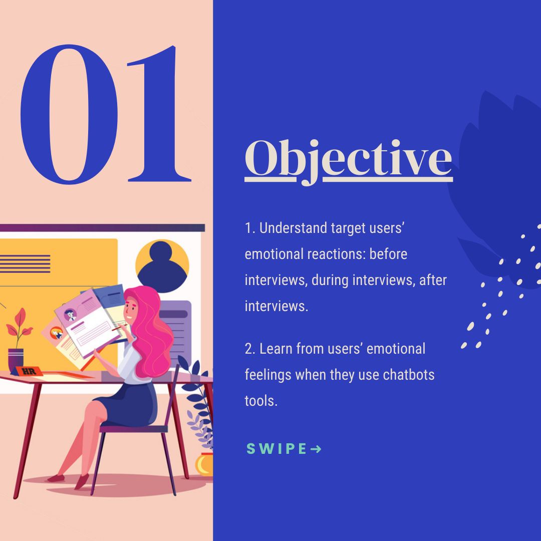
Objective
Based on my research questions, I decided to talk with people who are going through interviews and also people who are interacting with chatbots in more extended ways.
- Understand target users’ emotional reactions: before interviews, during interviews, after interviews.
- Learn from users’ emotional feelings when they use chatbots tools.
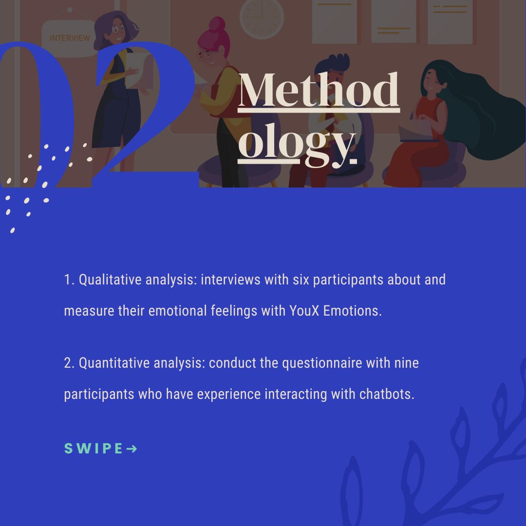
Methodology
I conducted two different approaches to collect attitudinal data from research subjects' points of view. I applied qualitative analysis on job seekers. And I used quantitative analysis to survey people who have talked to chatbots.
- Qualitative analysis: interviews with 6 participants about and measure their emotional feelings with YouX Emotions.
- Quantitative analysis: conduct the questionnaire with 9 participants who have experience interacting with chatbots.
Interview Plan
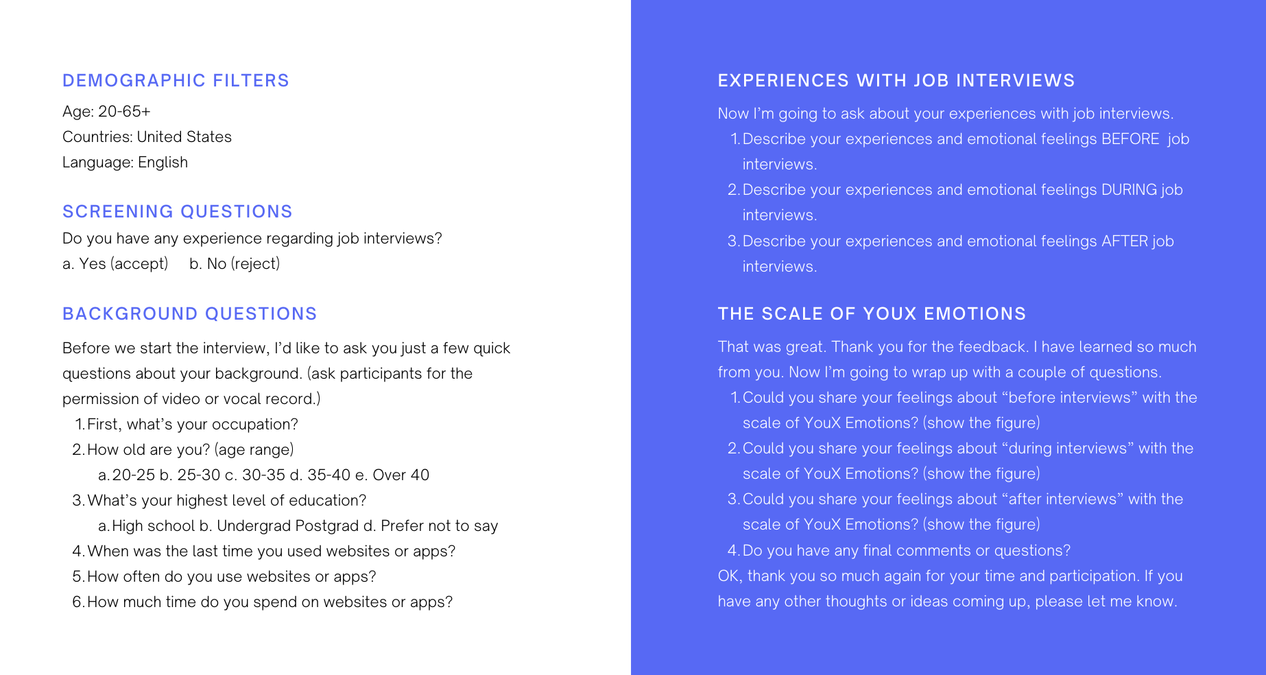
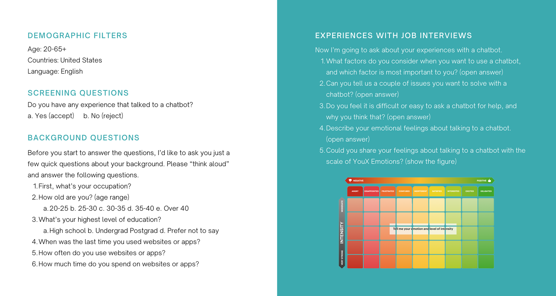
To understand the experiences of job seekers, I decided to the effective method for qualitative research. The interview helps me explain and explore users' opinions and behaviors. I asked seven open-ended questions to collect in-depth information. Here are my interview questions:
Questionnaire Plan
In the questionnaire section, I decided to use open-ended questions to bring up the possible data. A major reason for this is how users can pick up terms flexibly to express their emotional feelings. The participant can also describe their experiences with chatbots without restricted answers. In that case, the results rather than be coded by computers. The outcomes of the survey are classified according to users' issues through manual categorization. Here are my questionnaire questions:
Raw Data
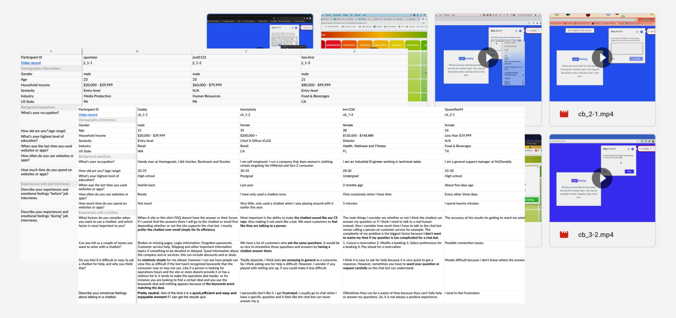
After the interviews and Questionnaires, I took notes of participants' video records. Please check the following link to see the research details of the raw data.
Findings & Recommendations
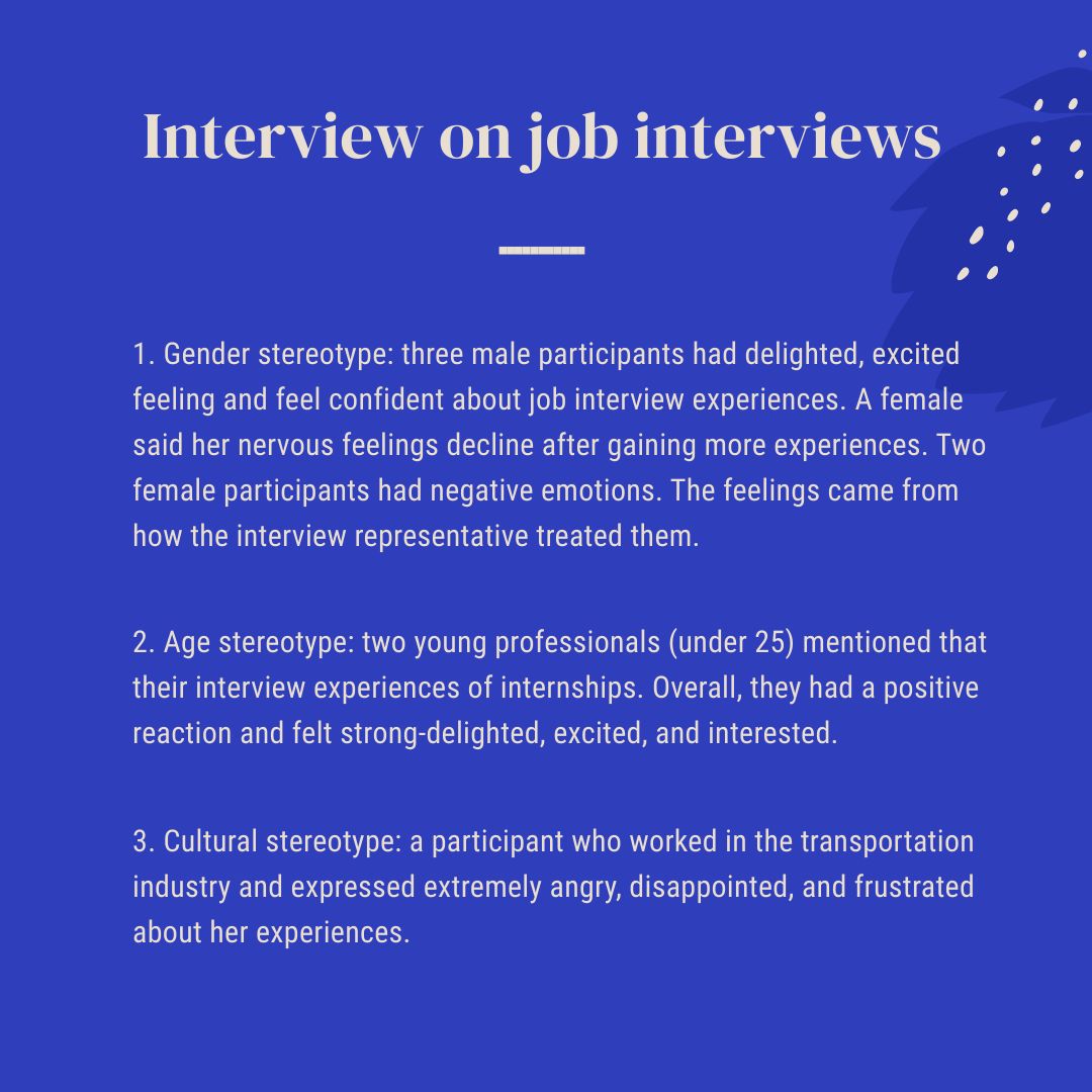
Interview on job interviews
The typical stereotypes regarding emotion do exist in this interview.
- Gender stereotype: three male participants had delighted, excited feeling and feel confident about job interview experiences. A female said her nervous feelings decline after gaining more experiences. Two female participants had negative emotions. The feelings came from how the interview representative treated them.
- Age stereotype: young professionals whose age under 25 mentioned that their interview experiences of internships. Overall, they had a positive reaction and felt strong-delighted, excited, and interested.
- Cultural stereotype: there is one participant who worked in the transportation industry and expressed extremely angry, disappointed, and frustrated about her experiences.
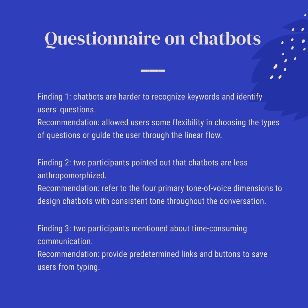
Questionnaire on chatbots
- Finding 1: chatbots are harder to recognize keywords and identify users' questions.
- Recommendation: allowed users some flexibility in choosing the types of questions or guide the user through the linear flow.
- Finding 2: two participants pointed out that chatbots are less anthropomorphized.
- Recommendation: refer to the four primary tone-of-voice dimensions to design chatbots with consistent tone throughout the conversation.
- Finding 3: two participants mentioned about time-consuming communication.
- Recommendation: provide predetermined links and buttons to save users from typing.
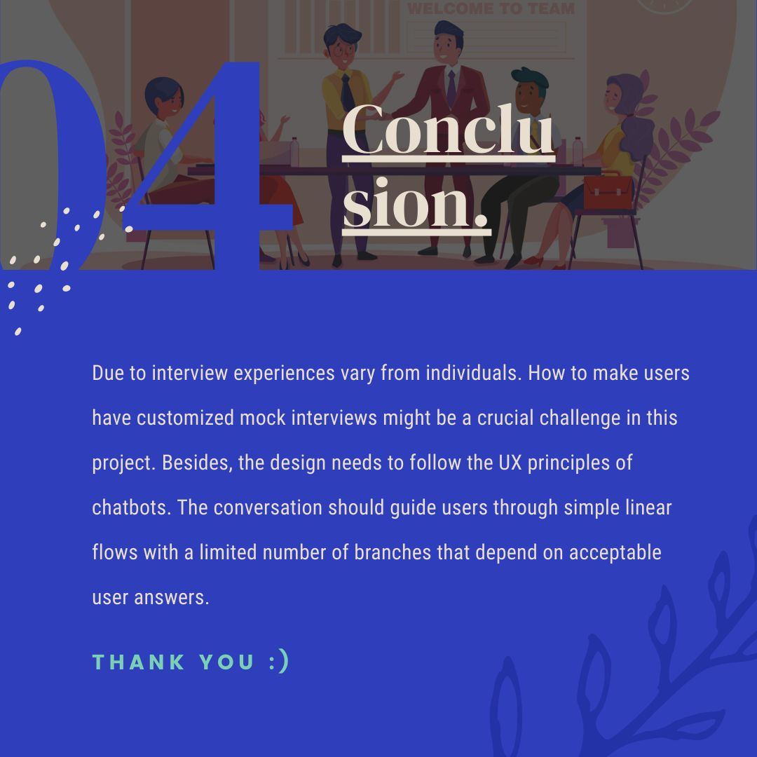
Research Conclusion
Due to interview experiences vary from individuals. How to make users have customized mock interviews might be a crucial challenge in this project. Besides, the design needs to follow the UX principles of chatbots. The conversation should guide users through simple linear flows with a limited number of branches that depend on acceptable user answers.
The Scale of YouX Emotion.
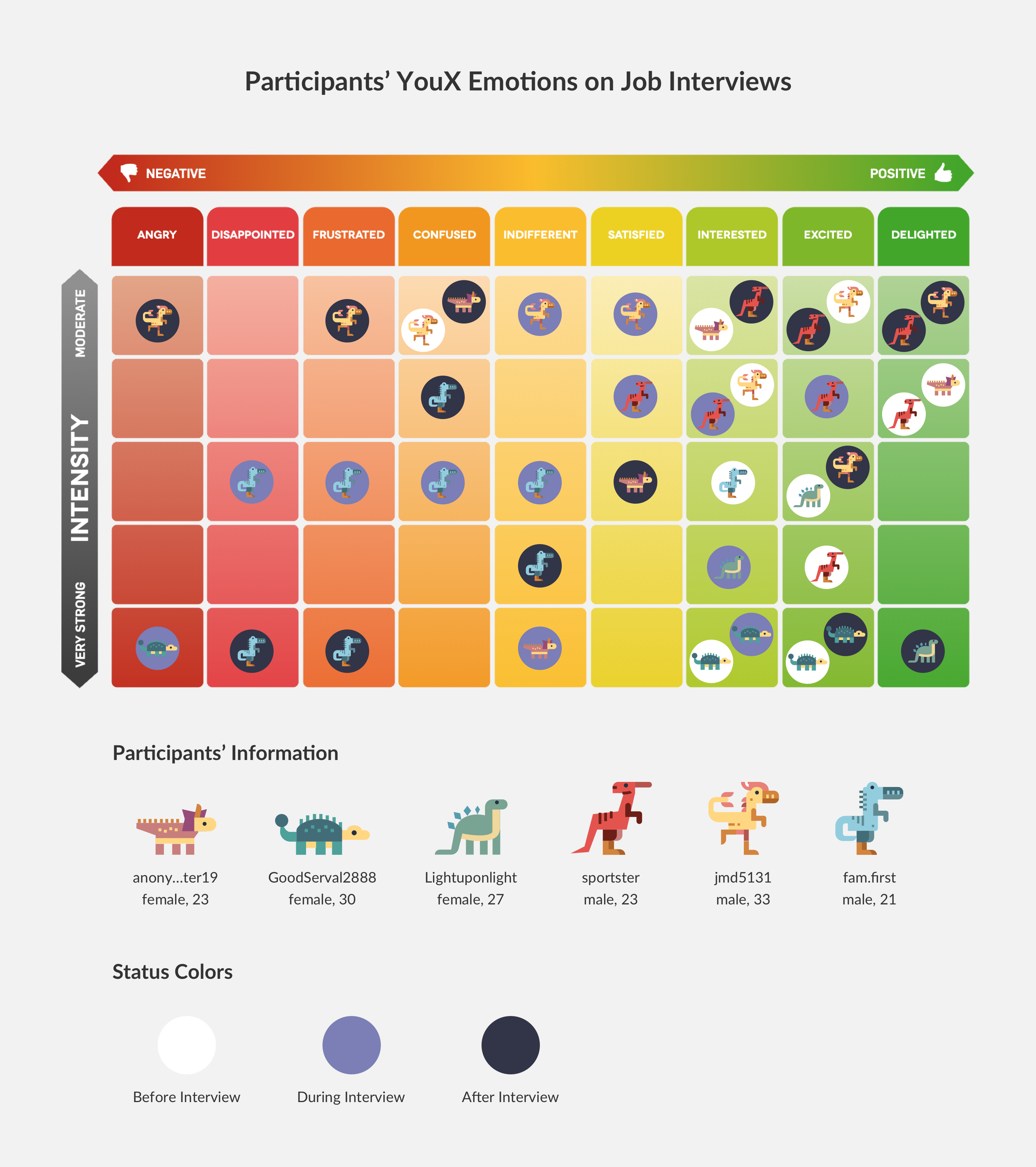
According to the finding of the interview on job interviews, I designed the figure below: to present participants' emotional changes before interviews, during interviews, and after interviews through three various colors. I created six avatars to represent each participant and show their emotions on the scale of YouX emotion.
What can you read in this scale?
- Before Interview: 5/6 participants have positive emotions. Only one feels confused.
- During Interview: half and half of the participants' emotions are either positive or negative.
- After Interview: 2/6 participants have negative emotions.
What's the opportunity?
- Before Interview: Customize users' training and help them learning without stress.
- During Interview: Gently suggest and remind users of interview tips.
- After Interview: Cheer up users who get negative emotions from the interviews.
Physical Model
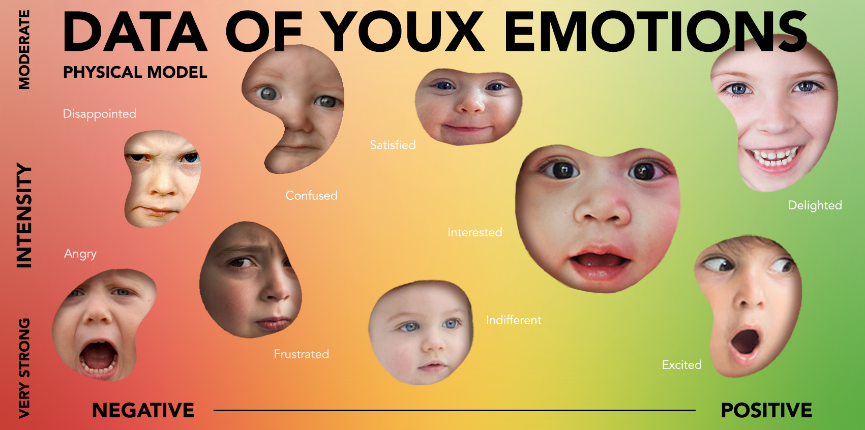
I also created a physical model of insights from my research. The figure presents the data of YouX Emotions. The inspiration refers to the data physicalization from Wikipedia. The discussions interpret how to read and understand the information and the cultural meaning behind the image.
How to read this physical model figure?
- Composition: Based on participants' emotions and their level of intensity.
- Size of Patterns: According to the number of times that be mentioned by participants.
Why to transfer the background into gradient color?
- During the emotion research, most participants described their emotions very ambiguously.
- I also agree that humans' feelings are more complicated.
- The emotion cannot merely classify into a specific category.
Why to choose the face of children to represent?
- Make a metaphor for original, true, non-hidden emotional feelings.
Instagram Carousel
According to the emotion research, I created an Instagram Carousel to share and promote my idea with six slides below. This social media presentation introduces the following key points:
- An introduction to my topic and research goals.
- The overall approach: why I choose the methods, who participated, where did I do the research.
- what I did in the qualitative research with examples(photos, materials, etc.)
- What I learned and what I might be a challenge in my project.
- Summary of crucial insights overall.
CREATIVE BRIEF
Human Persona
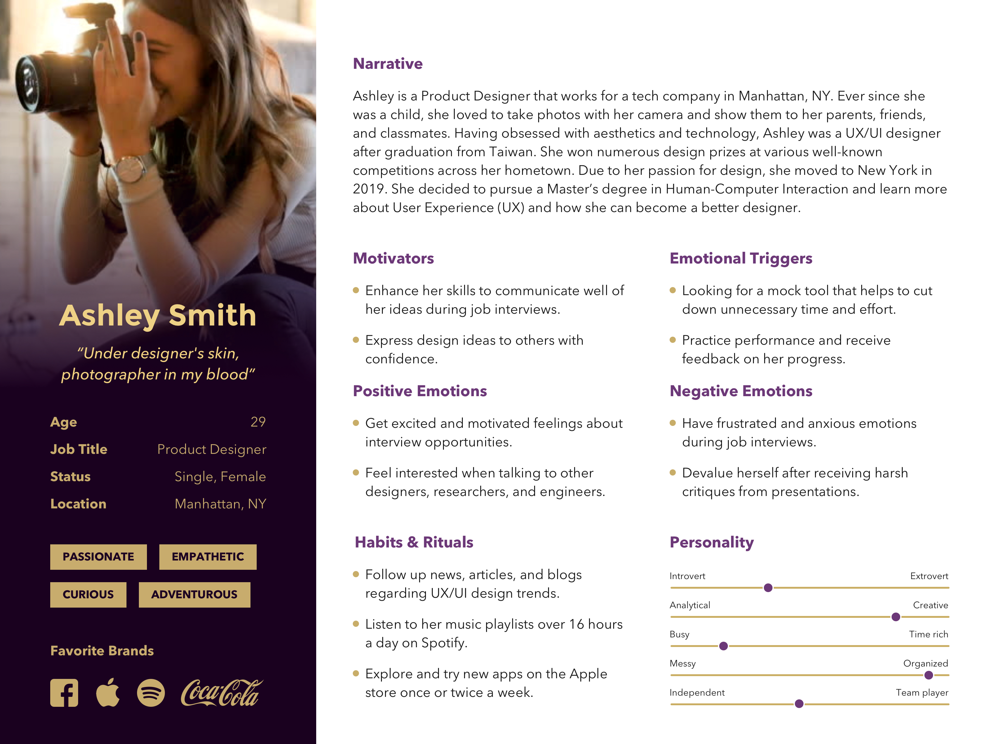
Audience: create a user persona with a fiction figure who is a job seeker. The user just graduated from school. And she uses this tool to enhance her skills and get a position in a new field.
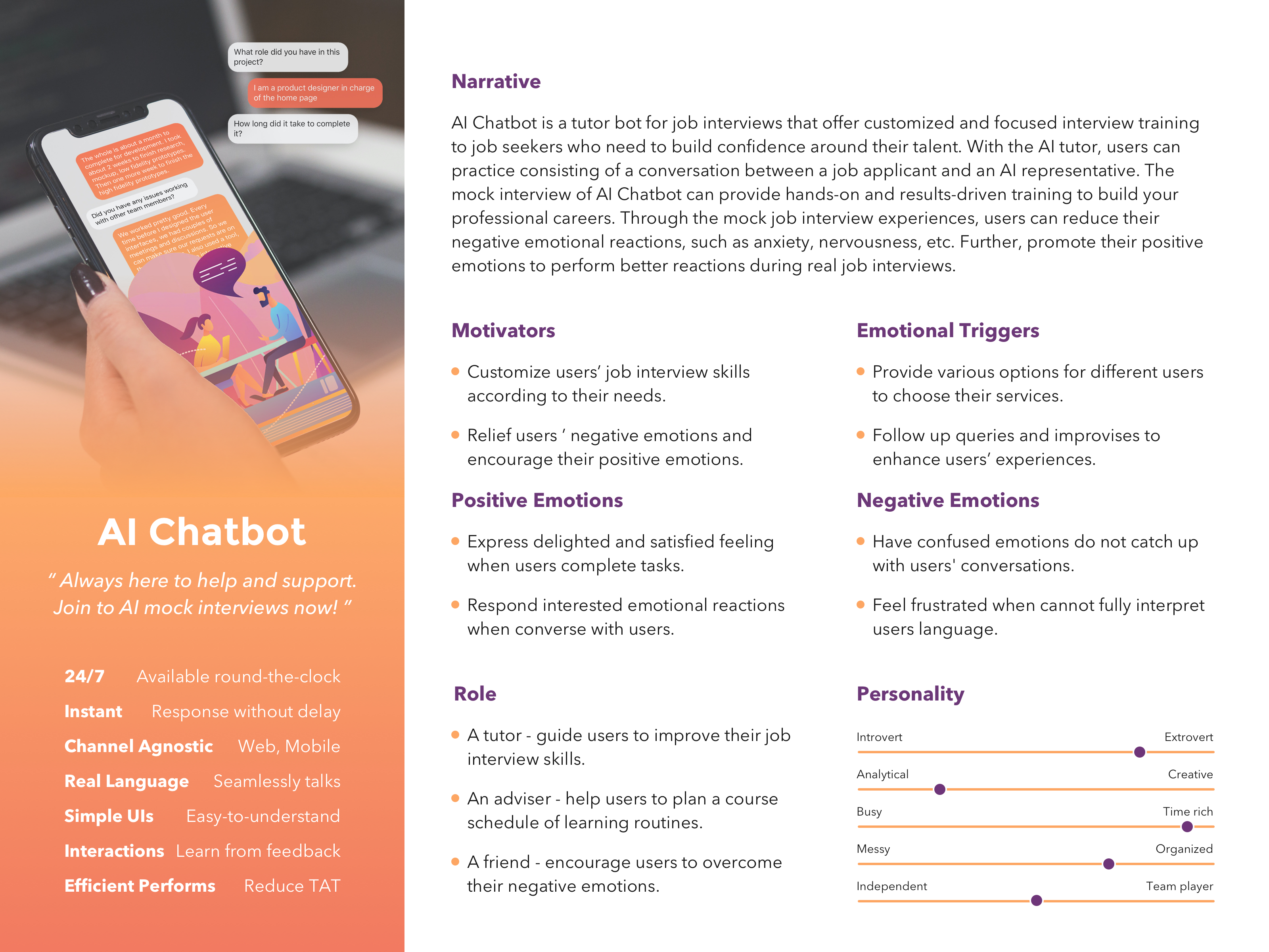
Object Persona
Objective: Deliver an AI chatbot as three roles for job seekers below.
- A tutor: guide users to improve their job interview skills.
- An adviser: help users to plan a course schedule of learning routines.
- A friend: encourage users to overcome their negative emotions.
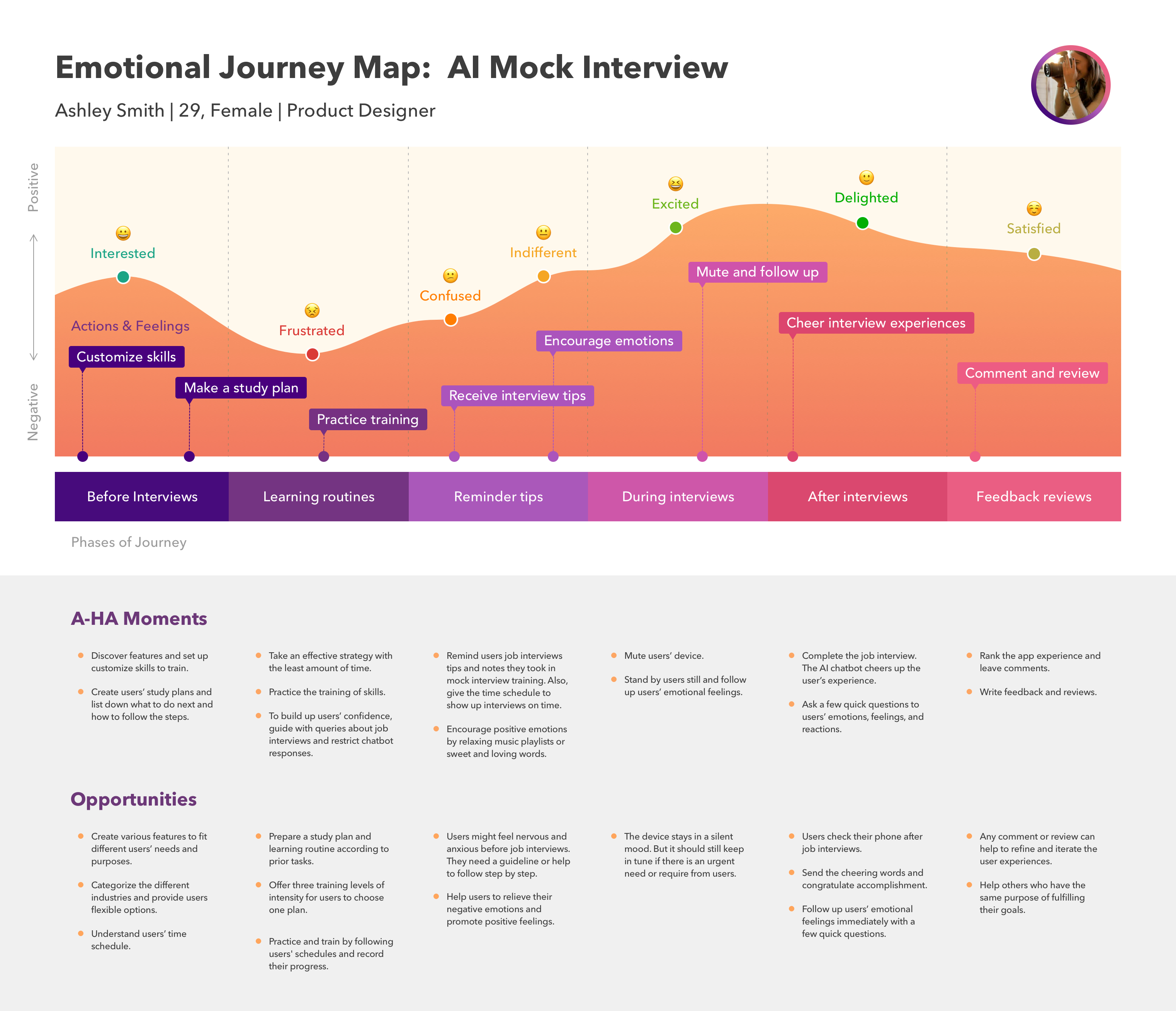
Emotional Journey Map
Insights: the alteration of the user’s emotion - from negative emotions to positive emotions:
- Feel interested when getting an interview opportunity and start to use the tool.
- Feel frustrated during practicing and training of mock job interviews.
- Feel confused when waiting for the presentation on the real interview day.
- Feel indifferent when entering the real interview environment.
- Feel excited when talking to the interviewer during the interview.
- Feel delighted after completing the job interview.
- Feel satisfied after the interview and gain the job interview experience.
Problem Statement
According to the insights of EJP, divide the phase of the journey into 3 processes:
- Set up an object: before Interviews, users keep learning routines.
- Refine the learning process: users receive reminder tips during interviews.
- Impact results: after interviews, users give feedback reviews.
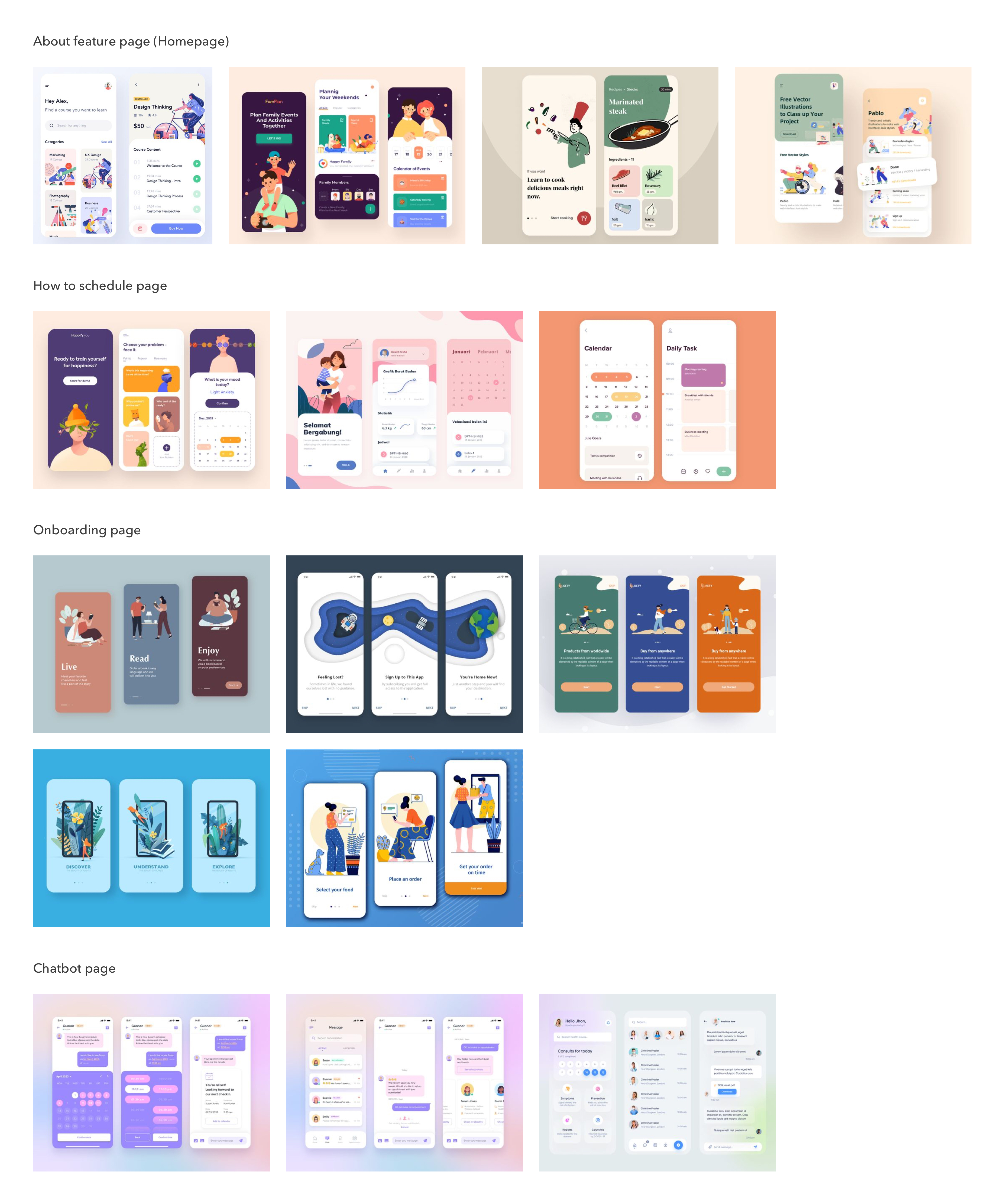
Aesthetic Mood Board
I researched the visual samples and categorize the images by the features below:
- About the feature page (homepage): provide a various and flexible option.
- How to schedule page: present the schedule plan with a calendar.
- Onboarding page: create serious illustrations regarding the core value of this tool.
- Chatbot page: keep simple user interfaces and restrict chatbot responses.
Ideate Solution
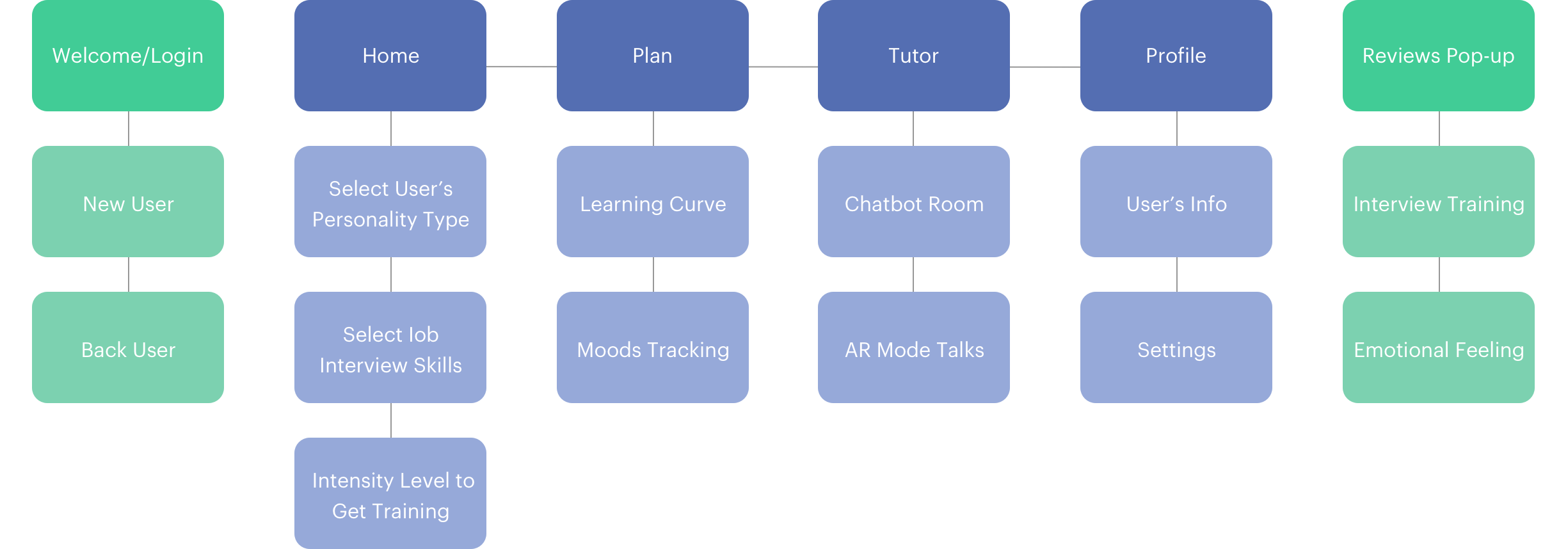
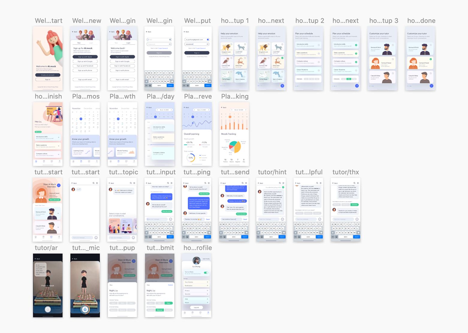
To design, I draw down the initial draft and the site map to ideate my design concept. Then, I jumped into Sketch software to create the high fidelity mockups.
Site Map
Screenshot of Sketch
MOCKUPS & PROTOTYPES
Welcome Page
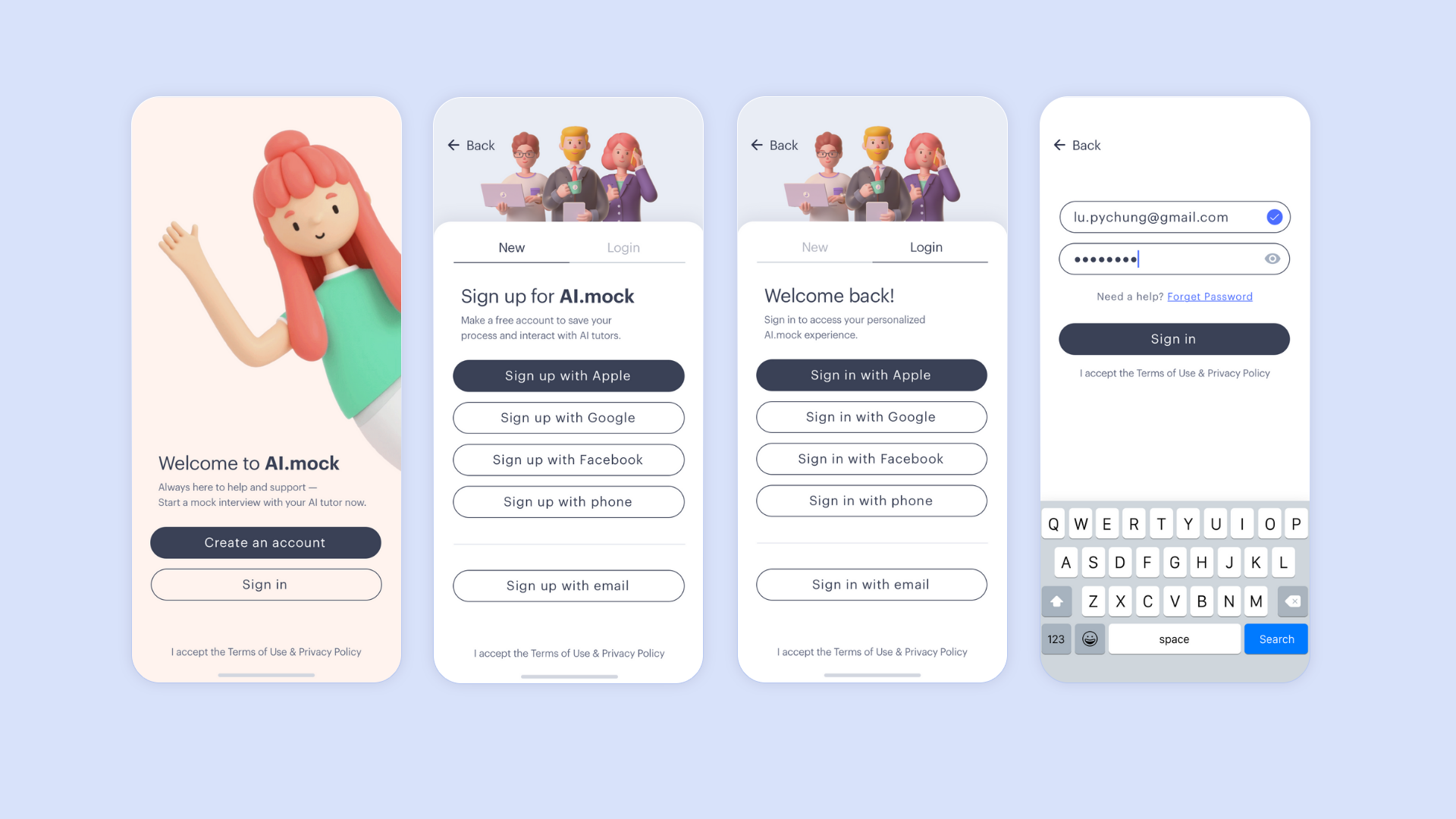
What's the problem?
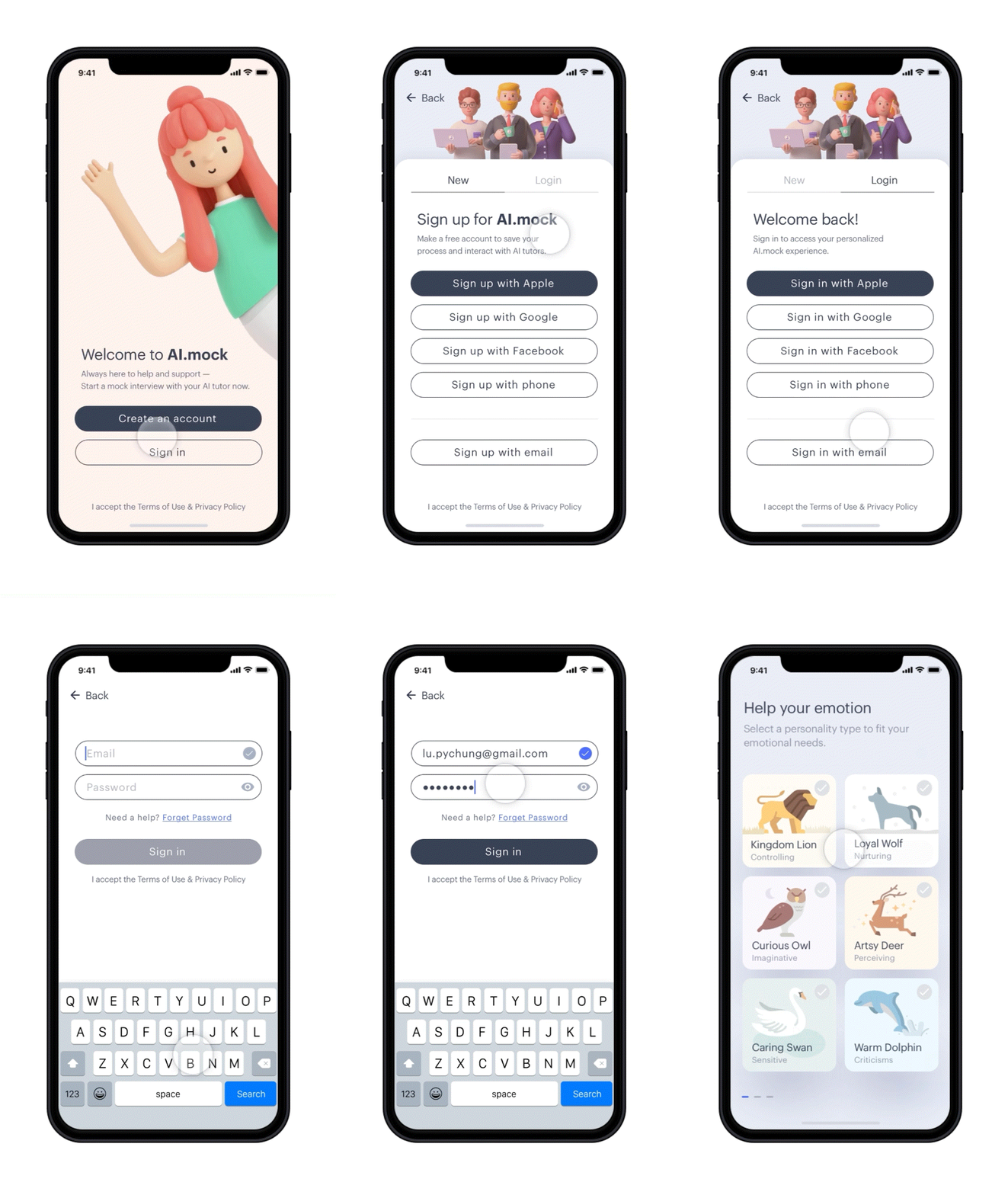
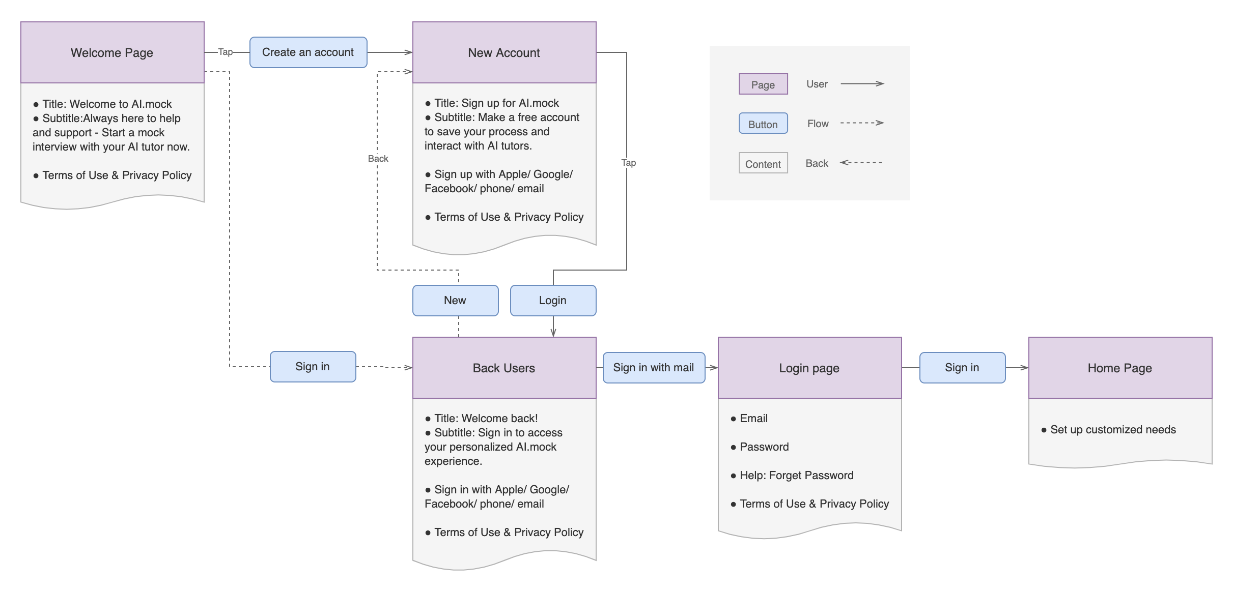
New users and back users face unlike scenario when they login the app.
What's the solution?
Provide new users and back users different registering experiences.
How it works?
Using tabs to switch between two users, and greeting them with various title and subtile.
For example as below:
- New users: Sign up for AI.mock. Make a free account to save your process and interact with AI tutors.
- Back users: Welcome back! Sign in to access your personalized AI.mock experience.
User flows
Mockups
Home Page
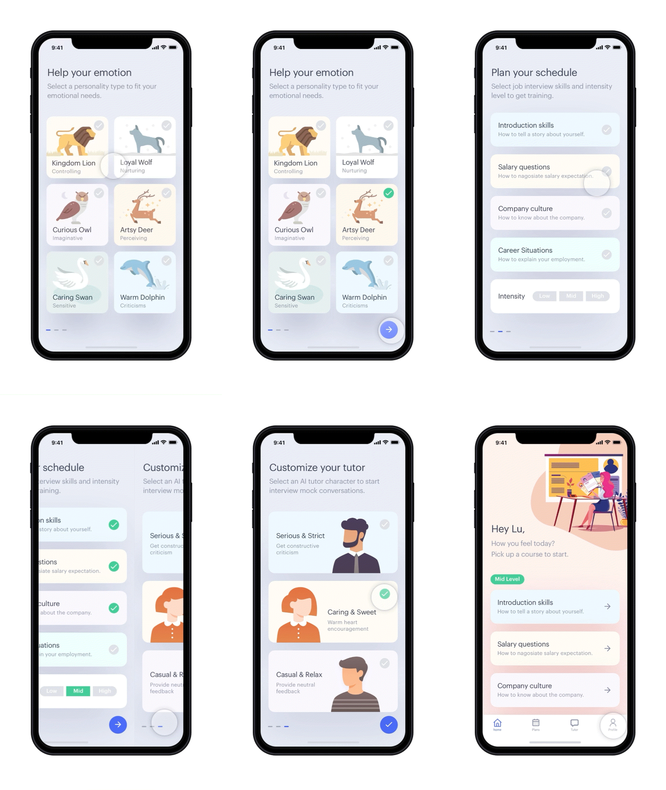
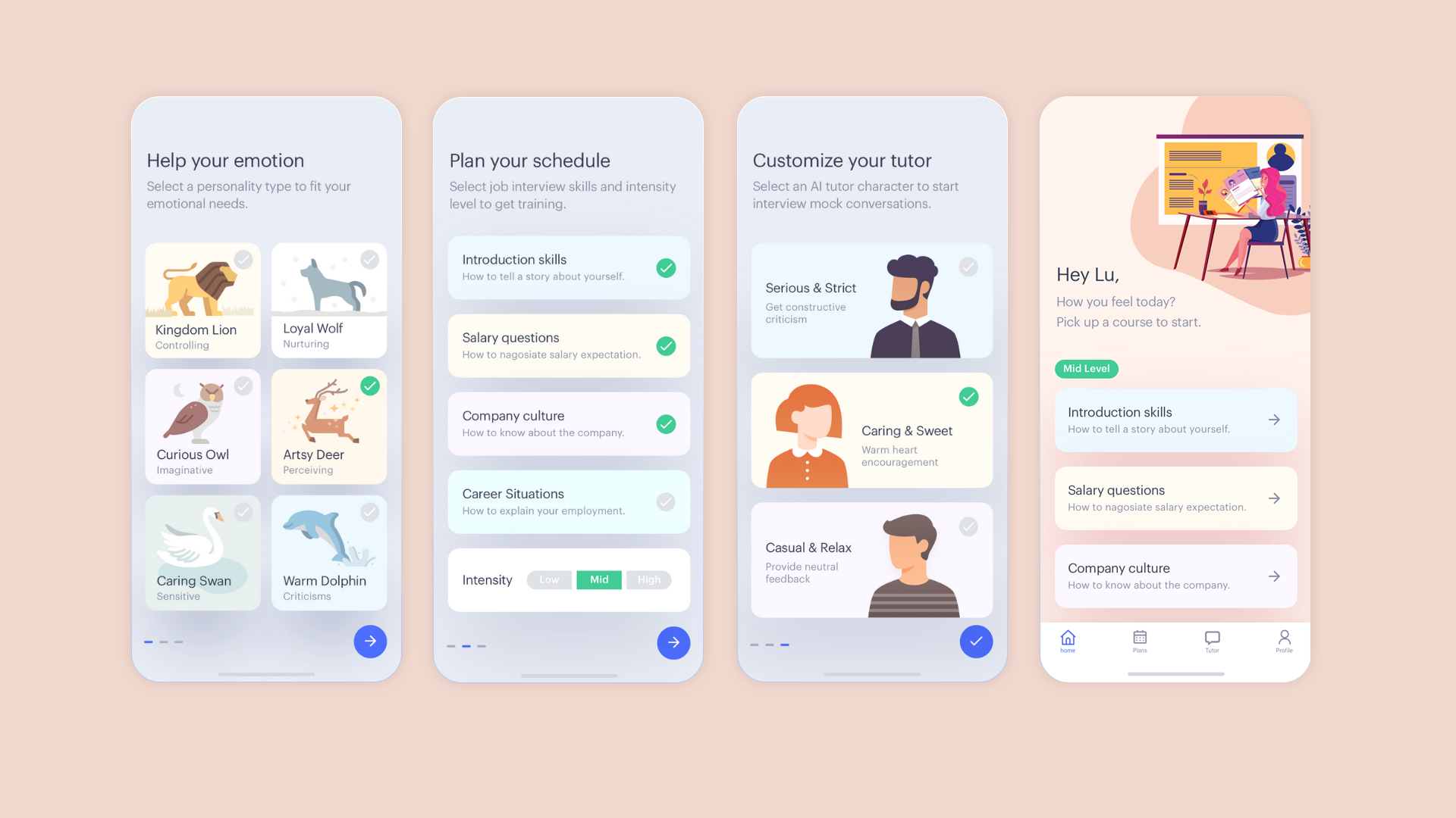
What's the problem?
The diversity of users' character cannot fit one standard training.
What's the solution?
Offer multiple choices that users can customize their experiences from their needs.
How it works?
- Represent users' temperament based on Myers Briggs personality types as animals.
- Users picked up the courses that appropriately fit their training plan.
- Make intensity level of learning into three degrees: low, middle, and high.
- Let users decide their AI tutor's character.
User flows

Mockups
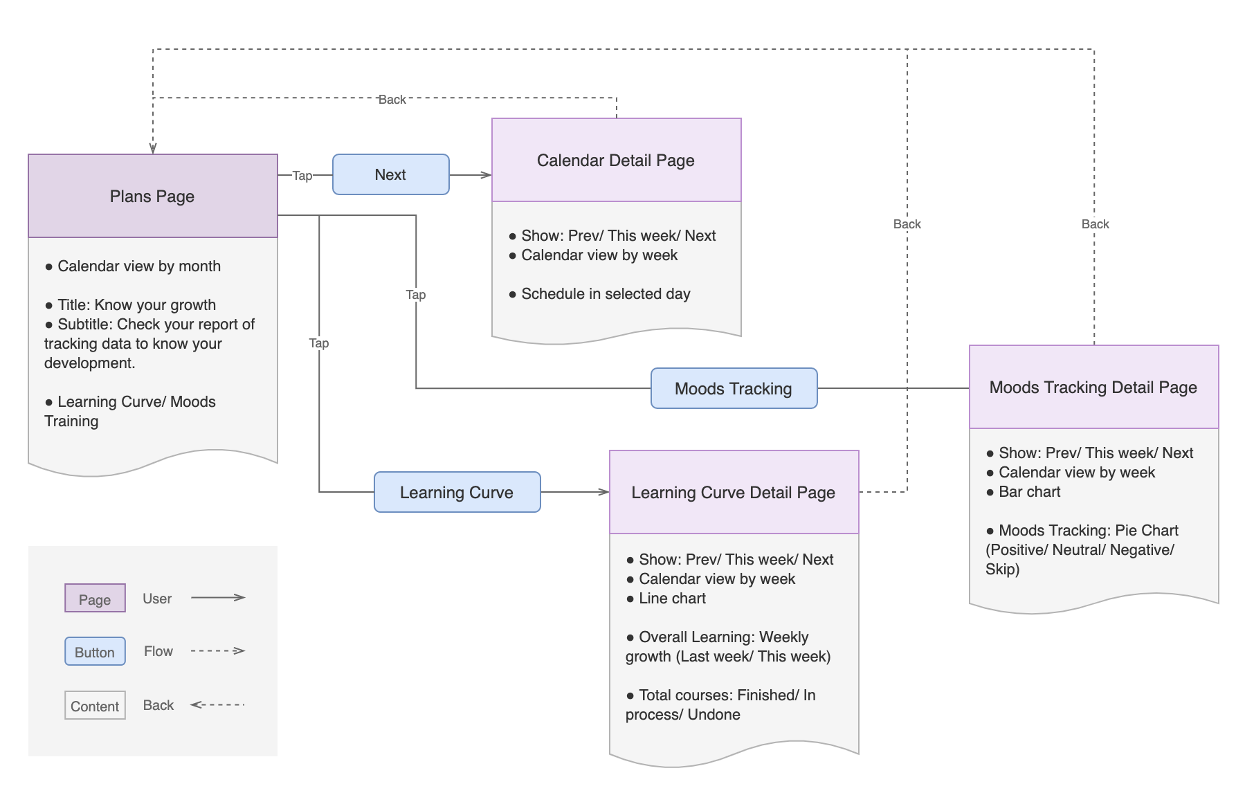
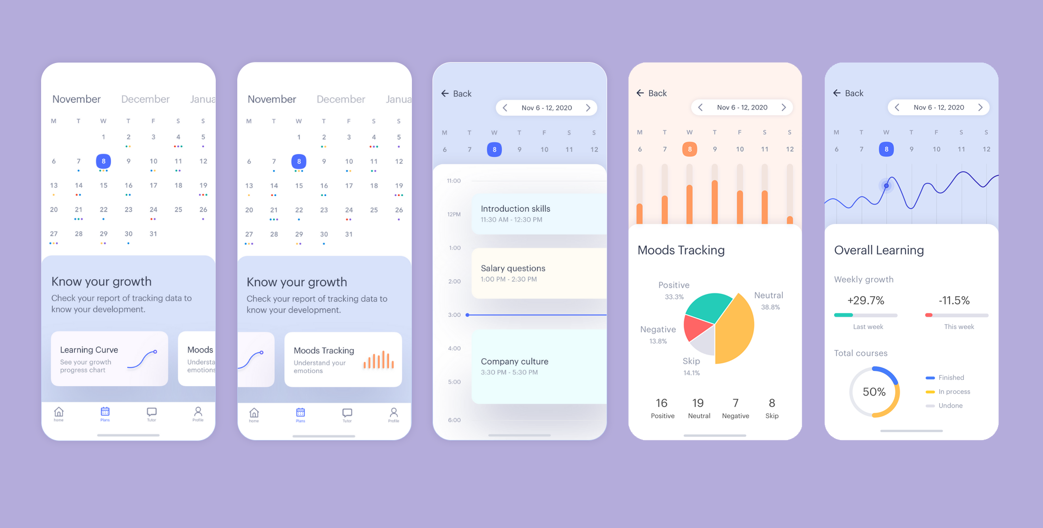
Plans Page
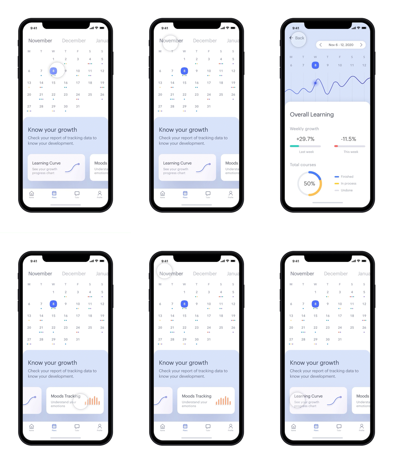
What's the problem?
Users want to know their growth and understand if the training improves their emotional feelings.
What's the solution?
Use ther information visualization to help users read their reports without confusion.
How it works?
- Users can choose to track their training process with the calendar view by month or by week.
- Collect the data from their training and their emotion reviews after the courses. And present the information in line charts, bar charts, and pie charts.
User flows
Mockups
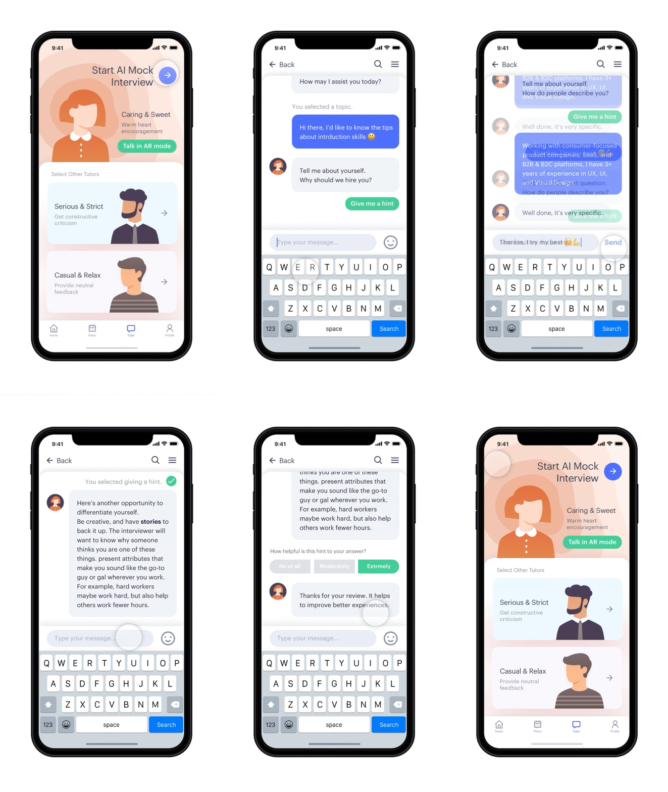
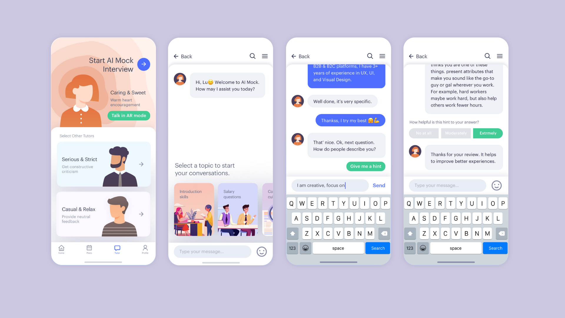
Tutor Page
What's the problem?
Based on the feedback from the questionnaire, participants mention about their communications with a chatbot are time-consuming.
What's the solution?
The conversation should guide users through simple linear flows and restrict chatbot responses.
How it works?
- After the chatbots greeting users, the system gives users the option automatically. Users choose a course and follow the flow to start the conversation with their AI tutor.
- If users need any advice for the answer after the AI tutor asks a question. Users can tap the button "Give me a hit," following by the dialog box.
User flows

Mockups
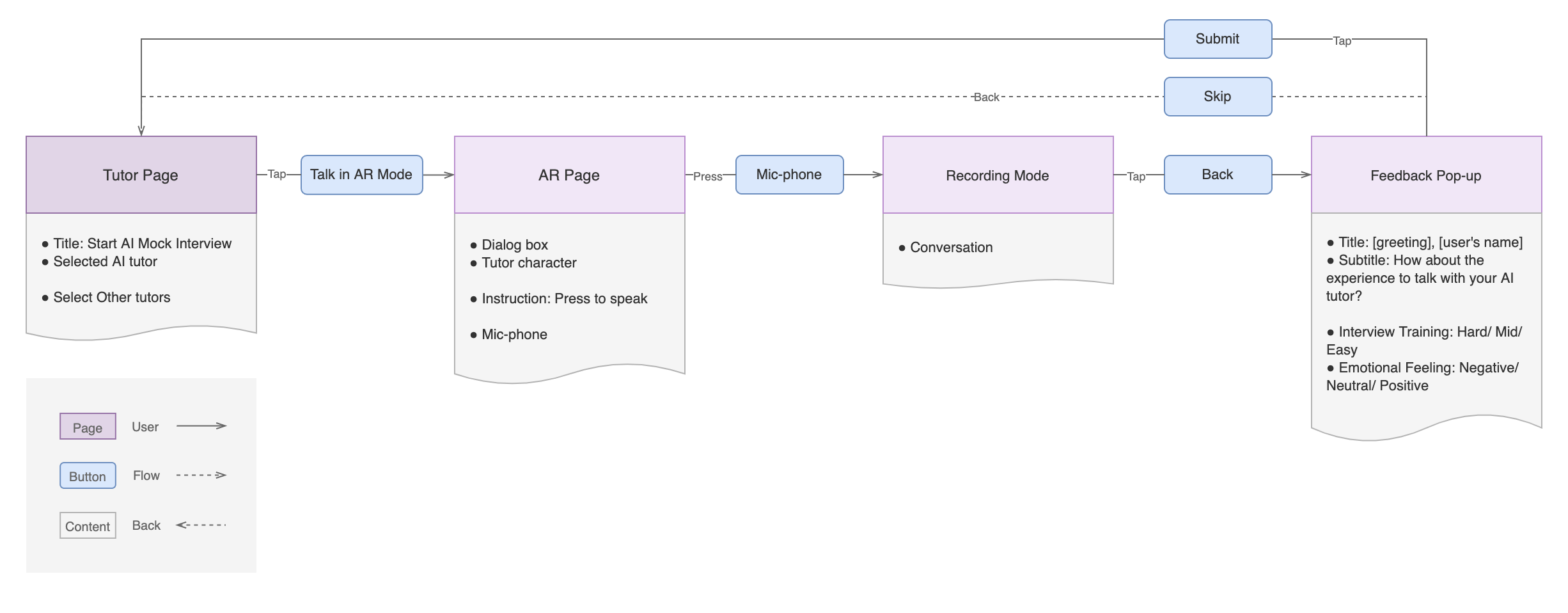
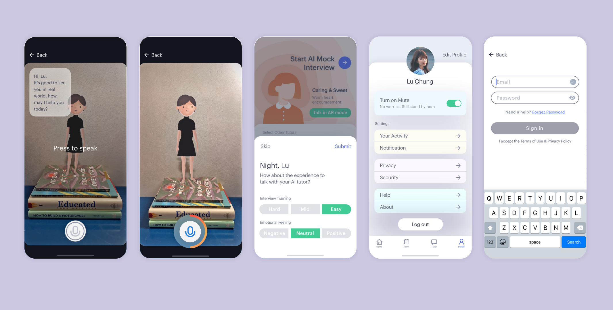
AR Mode
What's the problem?
Typing with chatbots has limitations that cannot mock a real conversation fully.
What's the solution?
Users build their confidence through speaking with their AI tutor. And practice their job interview skills with the verbal communication.
How it works?
- Create an augmented reality (AR) environment that users can have an interactive experience with their AI tutor in a real world.
- Users evaluate their training experience and give feedback to help the improvement of the AI tutor.

User flows
Mockups
Evaluation
I evaluated my project with Eli from Coffee Tech Talks. He gave me feedback regarding my Emotion Research. For example, the researcher should respond to the participant with a neutral reaction without encouraging, positive, or negative answers. Also, I did the peer reviews with Yi. He provided suggestions regarding customizing the users' experiences and the future insight. Based on his feedback, I came out with the idea to represent users' temperament based on Myers Briggs personality types as animals. And to customize their training from what kind of animal they choose.
FINAL PRESENTATION
I uploaded the mockups on the InVision website, and created interactive user flows for the features. Click the buttons below to see the prototypes and the final presentation slides.
PROTOTYPES VIEW SLIDES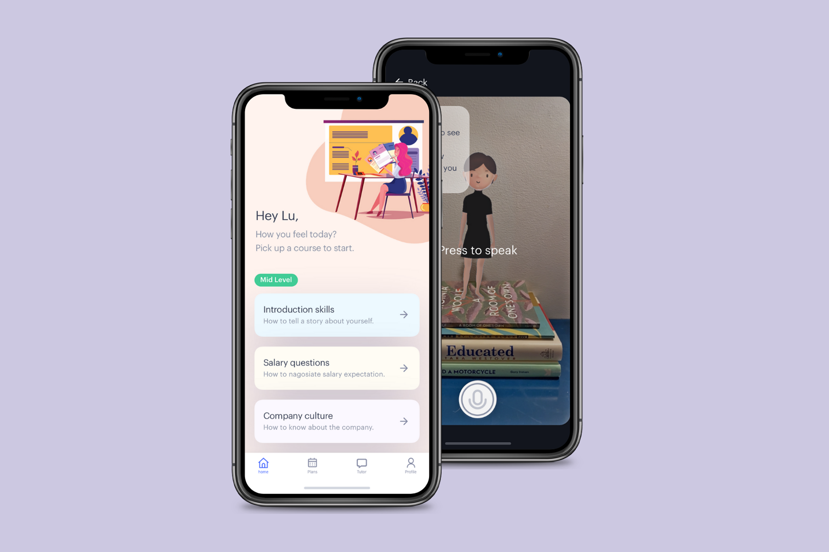
Web Design & Motion UI Prototyping
I used a rapid prototyping software, Principle, to design this animation video. It is a showcase of the website how it could look like to introduce the product.
REMARKS
Future Direction
What will/could be the next steps in the project:
- Visualize the data collected from users.
- Reminder and feedback features.
- Usability testing and iterate the design.
- Create site maps, user flow charts, and lo-fi prototypes.
Reflections
During this project, I found it very challenging to design a single user interface that offers a unique experience tailored to each user. I had to consider each individual as part of the collected data while also recognizing them as distinct "persons." For example, in emotion research, people working in different environments may encounter vastly different challenges during a job interview. Introverts and extroverts might require opposite approaches to learning and building confidence. To address these challenges, I designed a solution that allows users to select their personality type and adjust the intensity level of the courses to suit their needs.
