OVERVIEW
This is one of the largest app I’ve designed, I prototyped the user flow and devised the app interfaces, this product provide merchants a service to manage their orders and products, connect with staff, and track sales. In order to make a comprehensive introduction, I divided this project into two parts, for here, I will focus on the visual identity for graphic design and illustration. And the other part is about interaction and prototypes.
Also, during this experience, I learned new business model and management skills for iOS design guideline system that improved my understanding of building a mobile applications on the online-to-offline commerce.
OBJECTIVE
Mobile applications, graphic design
COMPANY
SHOPLINE
ROLE
UX designer, full time
PERIOD
Feb 2017 – Apr 2018
BACKGROUND
This is the design resulting from App products when I was a UX designer in an ecommerce company. The purpose of this service is to provide merchants manage their orders and products, connect with staff, and track sales with the Shopline app. Whether they are managing one or multiple stores, this app make it easy for them to run their business from anywhere.
Please contact me for the authority of the document.
All Archives
VISUAL DESIGN
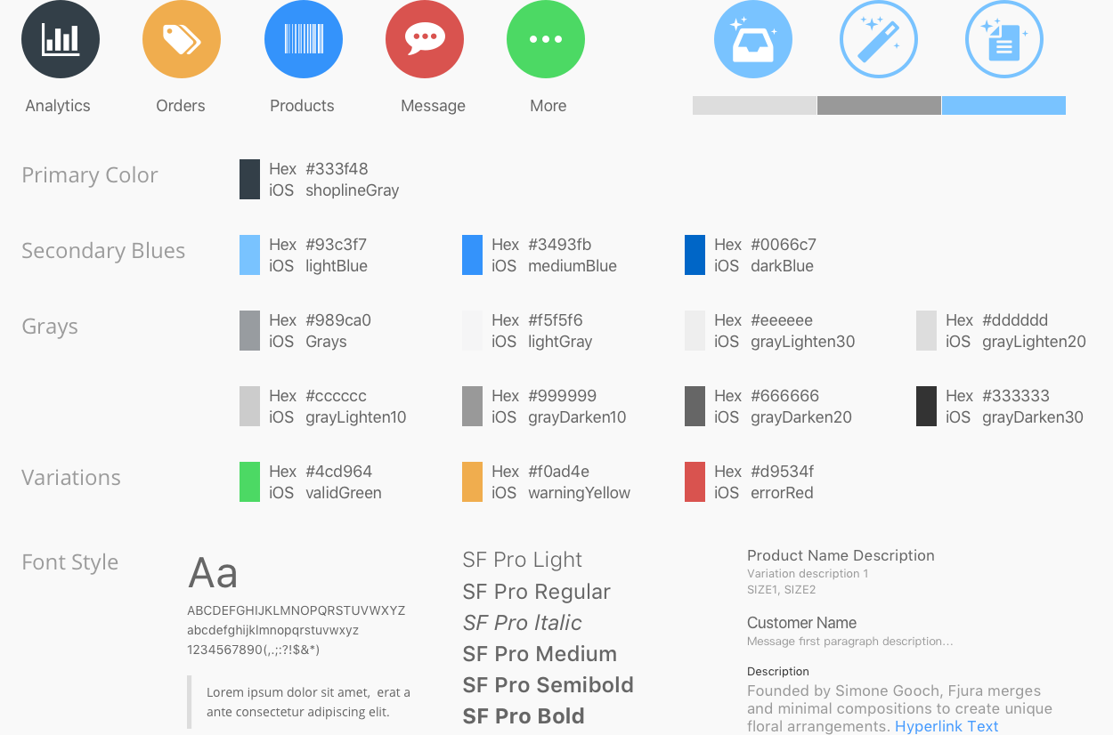
UI Elements & Design Library
Icon / Color Palette / Font Style

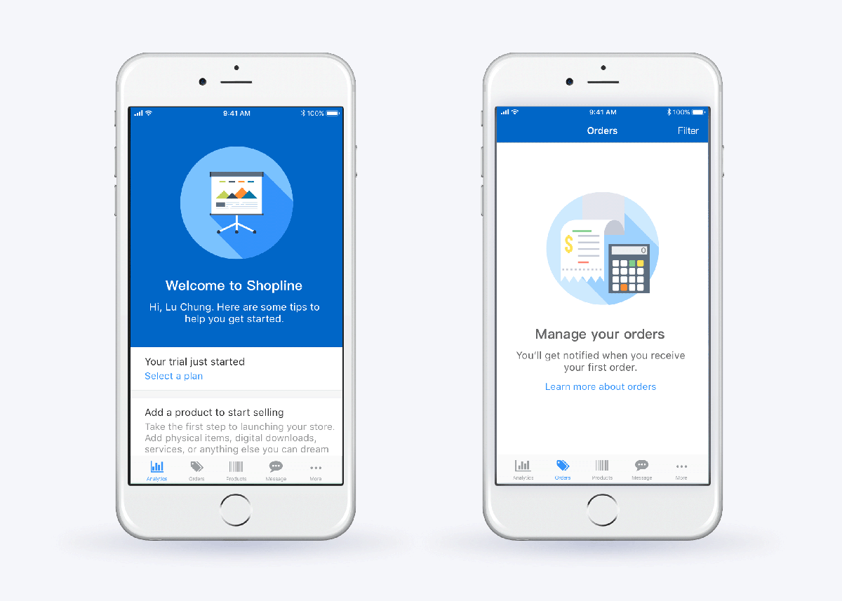
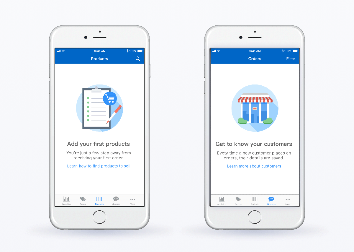
Illustration for UI Instructions
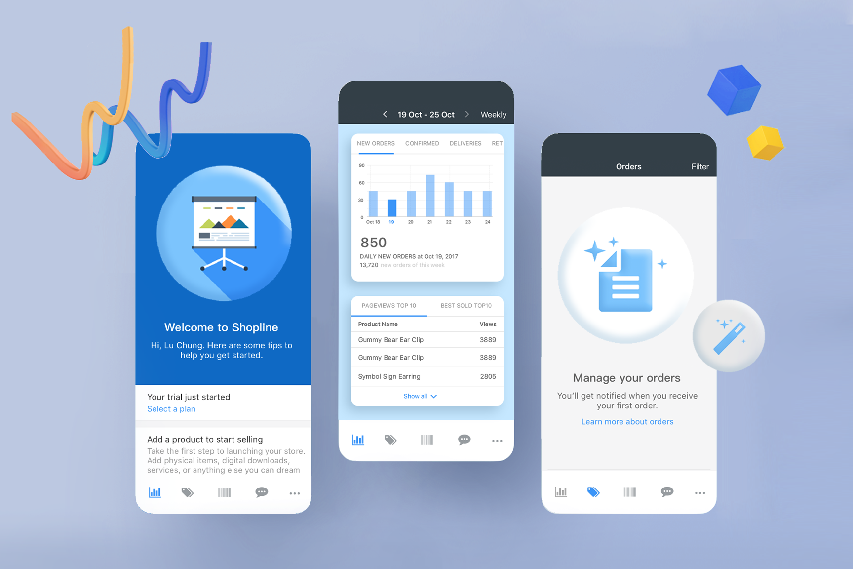
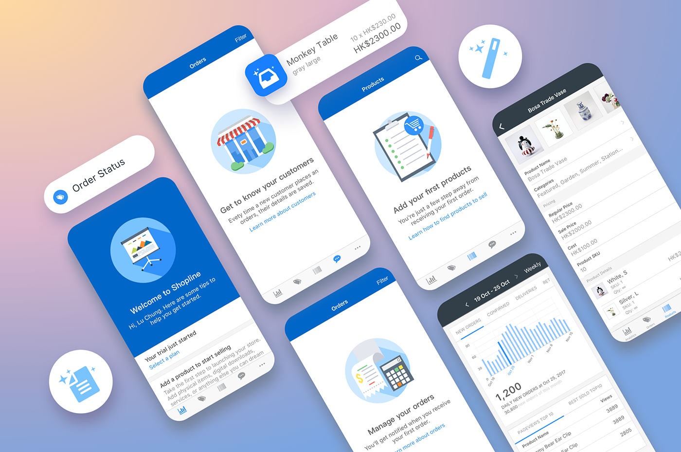
I created these illustrations to show the instructions for new users. The graphics present how they could set up a professional store in minutes and bring the brand to life. Impress your customers with a beautiful store, and all shop themes are fully responsive, which means customers get a consistent experience no matter how they browse the store.

Productivity Tool Speed up Selling Workflow
The service provides unlimited bandwidth, product inventory, and customer data. Review all orders and manage them from creation to fulfillment with the shop. Interact with customers or reply their questions by sending them some messages.

MOCK-UPS & SHOWCASE
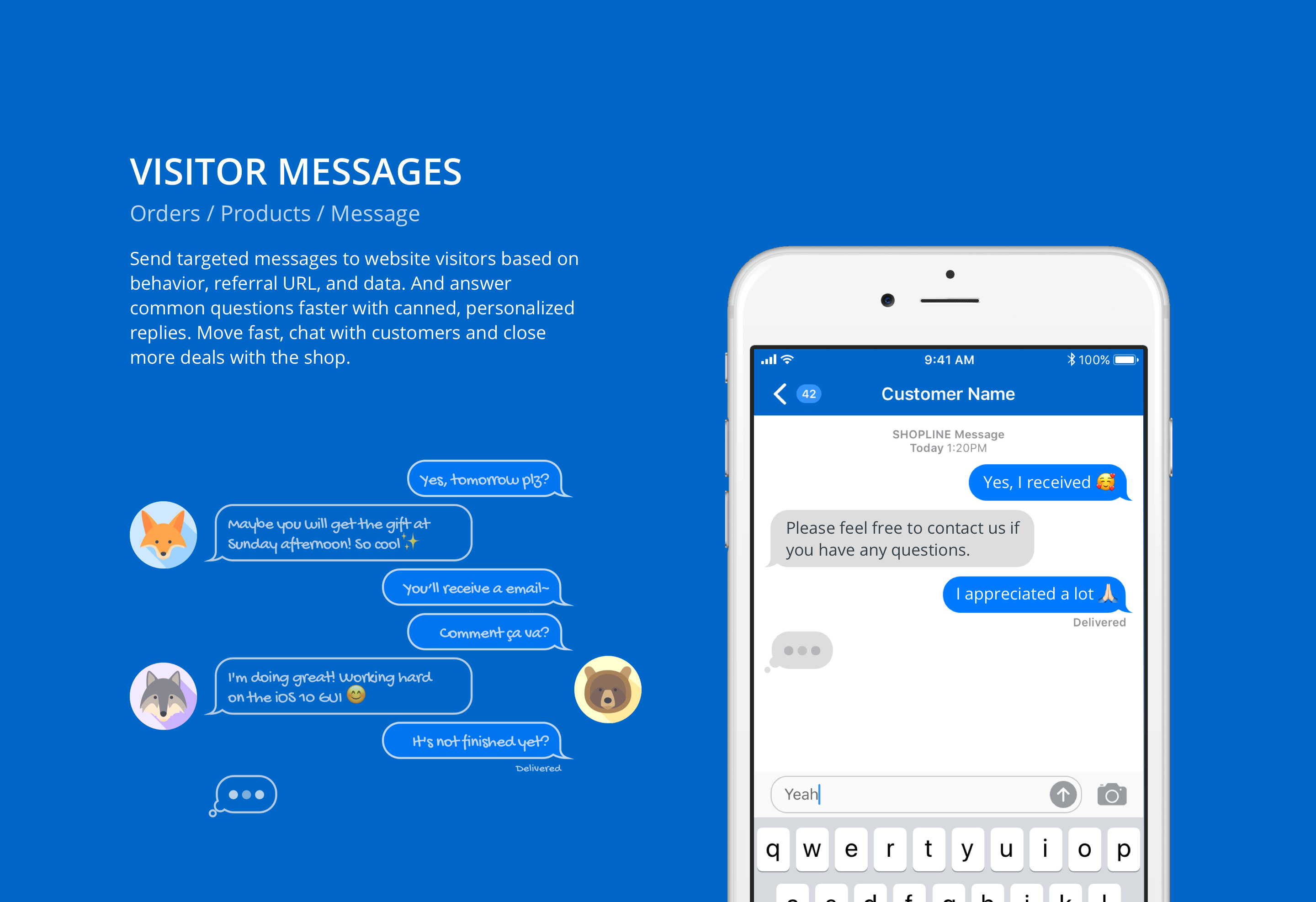
Reach out to Our Team to Get Help Immediately
Send targeted messages to website visitors based on behavior, referral URL, and data. And answer common questions faster with canned, personalized replies. Move fast, chat with customers and close more deals with the shop.

Further Insights of Whole Business
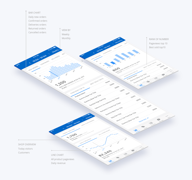
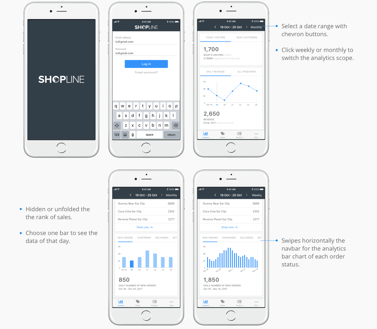
Use the analytics and reports to learn about data and reports of the sales and the customers. Analytics services are a great tool helping merchants to gain further insights into their business.

Orders / Products / Message
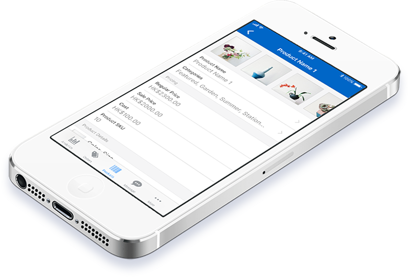
The product handles everything from marketing and payments, to secure checkout and shipping. With our admin platform, they can focus on the things they love, and start a business easier.

Ecommerce App Project: UX & UI Design
UX and UI research, job stories, flow charts, mockups, and prototypes.
OVERVIEW
The goal of this application project was to built a comprehensive system for managing the online-merge-offline retail. On the front-end, merchants can easily track their orders and plan a sale session for their store with the mobile app. On the back-end, the e-commerce company can learn customer behaviors and needs by the data collected.
OBJECTIVE
Design strategy planning, iOS mobile applications
COMPANY
SHOPLINE
ROLE
UX designer, full time
PERIOD
Feb 2017 – Apr 2018
BACKGROUND
There are four mainly types of feature to SHOPLINE admin platform: Analytics, Orders, Products, and other services. In addition, according to the customer feedbacks reports that as many as 70 percent of customers said they also included key customers, hoping to view these features on a mobile phone. Therefore, the team decided to develop the APP system for these main functions.

PROJECT GOAL
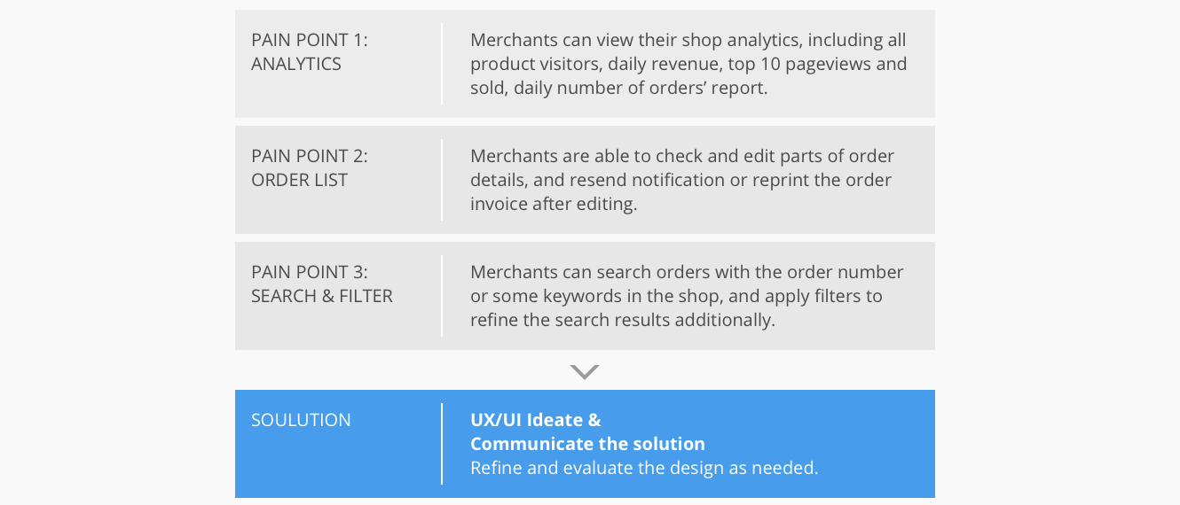
I used the feedbacks of usability testing from our customer which conducted by the development team. Users used Merchant App and gave some reviews through the Testflight, and I categorized these feedbacks into three project issue, in order to improve the features with the design strategy.

DESIGN PROCESS
I decided to follow Lean UX Design Thinking process to make sure that my design decisions were making the best practices of agile development, iterative development, user experience, creativity, prototyping and testing shine.

JOB STORIES
I used the feedbacks from our customer that conducted with the Textflight tools, which users would use Merchant app and help us to understand their motivation and desired outcome. I integrated their reviews and needs as following examples.

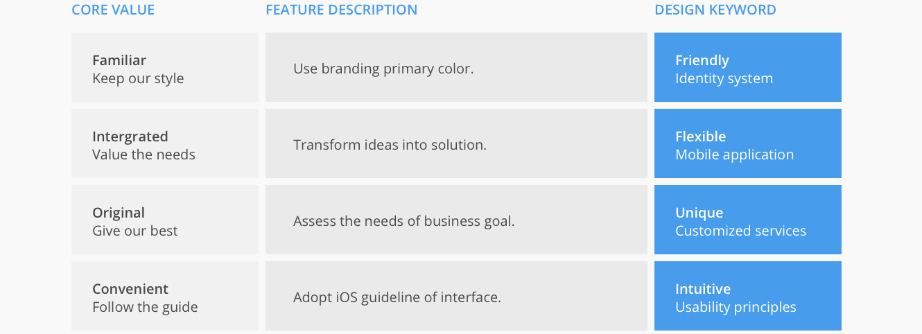
DEFINE CORE VALUE
In addition, I decided to follow the principle and belief of the organization, views, and design Merchant App with our core value which represent familiar, integrated, original and convenient. And transform the core values into four design keywords: friendly, flexible, unique, and intuitive.

RELATED RESEARCH
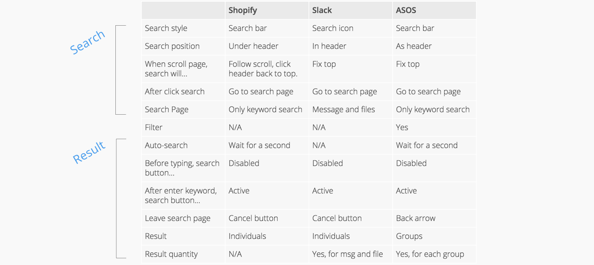
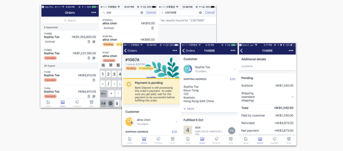
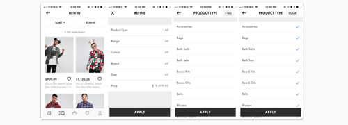
After defining the customer’s needs and insights, I analyzed the relevant interface, for instance, Shopify, Slack, ASOS as the main reference. For a deeper understanding of the behavior of searching orders and setting filters, I sort out a comparative table of the user interfaces and their task flow.
Research-1
Research-2

Then I prioritized each project issue based on its importance to the user as well as its importance to Merchant App. My assumptions about the importance to users were derived from the analysis of our customers testing feedbacks and requirements. Analytics, Order, Search and Filter were developed in the phase one, and they were also core functions of the product. Therefore, I did background research of these features, and studied their user task flow.
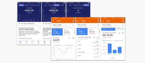
Analytics
- For the analytics chart of Total sales and Online Store visits, categorizing datas to Today, Yesterday, This week, This month.
- Scroll from right to left to check analytics chart in sequence.
- The details of Total sales include the orders quantity.
Orders, Search
- Scroll down the page, Order Date fixed on top.
- To search the orders, clicking search bar and go to Search page.
- Enter the keywords of the orders, and click search button or wait for about a second, and the related orders are displayed.
Filter
- Tick up the options and apply the filter to search products.
- Or choose the all button to tick up every option, then untick some options.
- When the options are ticked, use clear button to reset the filter.
FLOW CHART
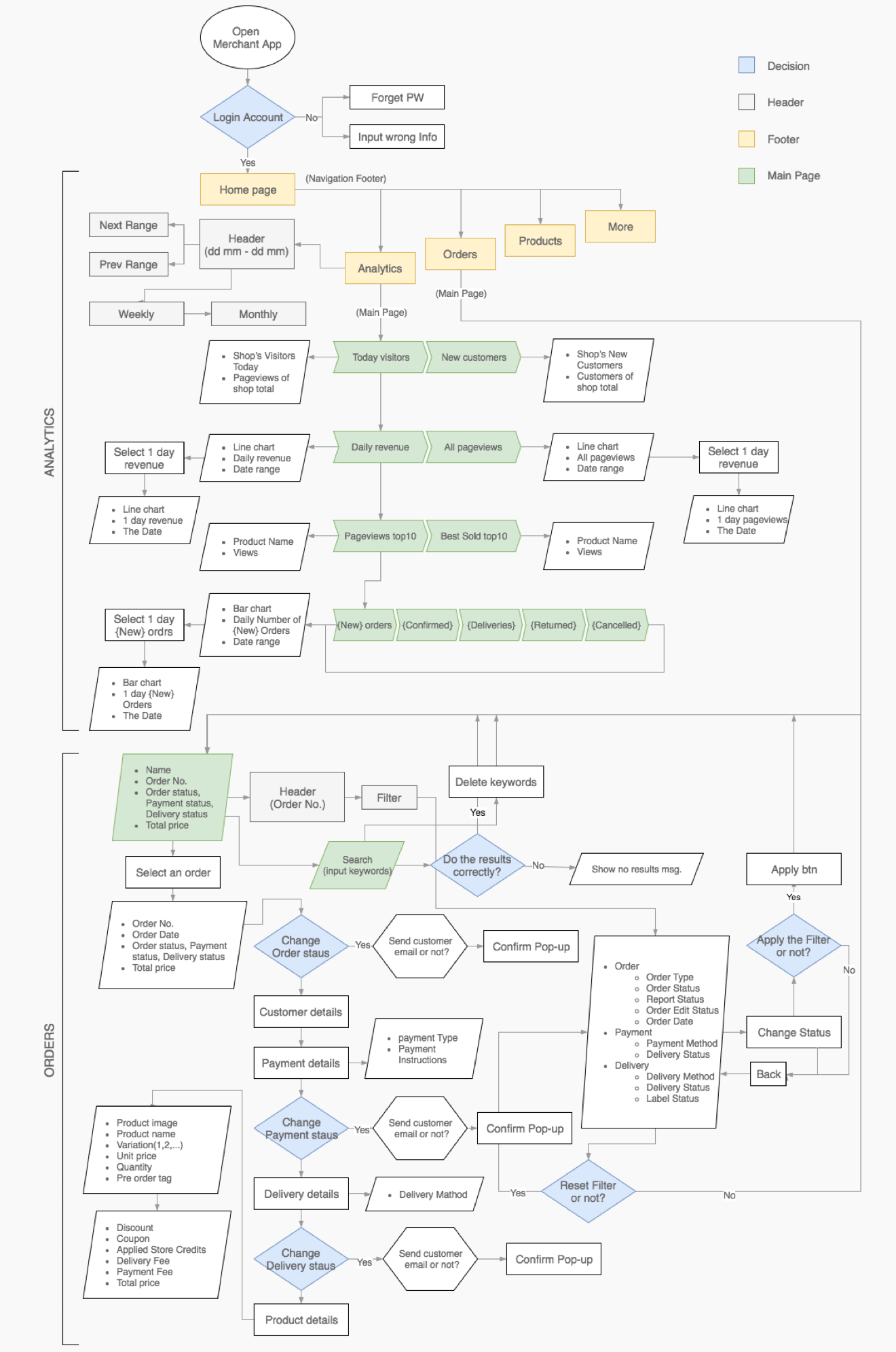
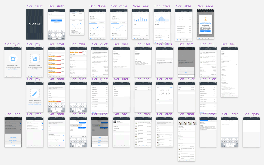
I also created a flow chart to show the solution model for the Merchant App. In the development phase one, the process as below illustrates mainly two features: Analytics and Orders. Follow from the processing step, the users first log in to their account and start at Analytics main page. Click the buttons below to see the workflow charts for Analytics+Orders or Products+Message.
Analytics, Orders
Products, Message

IDEATING THE SOLUTION
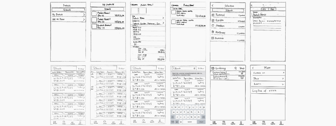
The envisioning phase played a key to create preliminary ideas that focus on solving the user’s pain points and not mindlessly attempt to revise user interface of Merchant APP. Therefore, I did some lo-Fi drafts and used the feedback of the user testing to refine my sketches and narrow down my solutions for the hi-Fi mockups.

After sufficiently discussing with my teammates, I jumped into Sketch present hi-fi mockups of my design decisions and create a clickable prototype with Invision App.

PROTOTYPING AND VALIDATION
Below are the hi-fi mockups of my final solutions, including the results of the before and after implementing my design solutions. Click the buttons below to see the prototypes for Orders+Filter or Analytics+Products.
Orders+Filter
Analytics+Products
Pain Point 1: Analytics
Design solution: The key problem of Analytics interface is a user overloaded with too much information, in order to cut out this clutter, I assigned the them into groups depends on their constituent elements such as today's number, a line chart, a rank table, a bar chart. A user scrolls down the page, and reads card layouts in sequence with coherent visual metaphors.

Pain Point 2: Orders and Order Detail
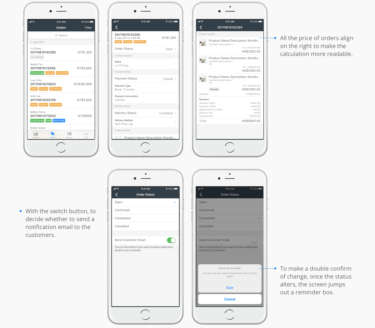
Design solution: It is important for users to make them feel familiar with the order status that they can search the orders easily, so I designed them following the color principle of admin dashboard. Furthermore, users can quickly edit order status in order details, and click chevron to view more customer's information or delivery address.

Pain Point 3: Search and Filter
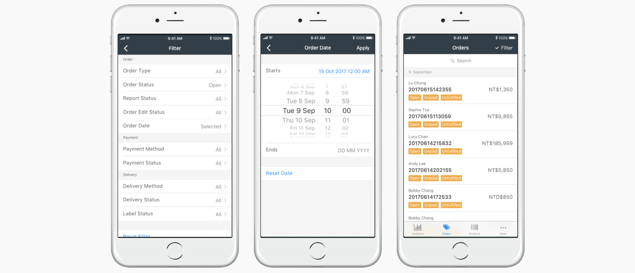
Design solution: In spite of the filter usually be considered as an additional search tool, they are a crucial method to help users refine their search. To set up the filter, users click the button to set up the options. In the filter page they can browse through the title of categories first, then find out the option in the short list, or click the reset button to clear up the criteria. After refining the search, a tick shows beside the filter button to remind users of it.

SUMMARY
Mobile screens differ from desktops, with users tapping faster and focusing on one task per page. Mobile apps should prioritize clarity and minimize distractions, especially given their portability, which benefits clients who travel frequently. This makes merchant apps increasingly mainstream, as they enhance accessibility and transform business operations.
For product designers, the shift to mobile emphasizes the need for clear, intuitive interfaces tailored to smaller screens. Design choices such as navigation, font sizes, spacing, and colors must align with user preferences. Even minor details, like filter placement, can significantly impact the user experience, ensuring ease of use and efficiency in a fast-paced, mobile-driven world.
